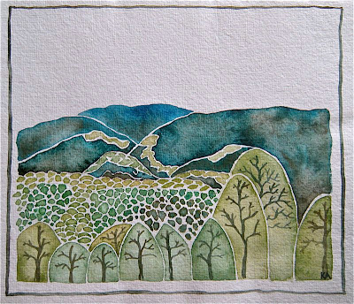
all polished up isn't necessarily better
I tend to get really tight and overthink it, overwork it
can you see the difference between this one and that one?
that one
that one
oh well
I don't know if I'll tackle it again .....
I think I'd rather go for a bike ride


17 comments:
I do see the difference, and the softening of the hills gives them more complexity and mystery, I think, which is more like the Smoky Mountains, I think. Bravo on both, though --
I know that I feel undue pressure when asked to create something ... or even when creating something for someone else.
What you've created looks pretty darn wonderful to me!!!
the saying "we are our own worst critic" is so true!
I continue to be amazed at when I look at something I've created on the computer screen ... boy does that ever help me "see" it!
Happy weekend to you and yours!
oxo
p.s. not a helpful critic when I truly Love everything you create!
OK looked again, the softness of the hills in the last one is especially pleasing ... but good golly Ms Molly you do beautiful artwork!
oxo
well honestly i love them both. i like the define lines in the hills. but i also love the softer, more water-colored effect of the second one. Good job on both!
i know how hard it is sometimes to be satified with our own work. i find setting it aside and working on other projects gives me a whole new outlook on a past work. sometimes i even find i *gasp* actually fall in love with one i didn't like :)
Yes, I do see the differences. And to tell you the truth, Kimmie, both of them are beautifully composed and rendered. The first is a tad more defined and seems to be a bit bolder; the second is more simplistic and appears to be "softer" in color. Don't be so hard on yourself - they're lovely! Have a super weekend! Hugs, Terri xoxo
both are beautiful...but the new one does seem to flow, float a little differently...nice day for a bike ride?? hope so, dear kimmie...
I like both pieces!! I love the tree halos...
OK, I didn't mean to sound so critical .... I was speaking as a fellow watercolorist. What I should have said- "When a painting of mine bugs me I look at it in a mirror. Usually I can find the problem that way."
Cindy - if you thought that was critical -sheesh - you guys are so easy :) for you to say you didn't like that weird little valley either was great - I knew I wasn't going crazy :)
critical is when you have stand up in front of art class showing slides and everyone has something to say about every single slide - and not just trying to be nice and gentle either :) .... (that was a photography class)
I can see the difference and I love them both!
these are some of my favorite colors ... it would be hard to choose
I love the colour scheme - so cool & peaceful - I love them both actually !
I see the softening of the hills and really like the revised hills. I think there is too much "white space" in the trees in the second one. Of course, that is only MY opinion. I just prefer the look of the first trees better, but the overall composition of the second is super. Like Terri said, "Don't be so hard on yourself." Both really ARE lovely. I only wish I could draw like you. You'd be so happy with either if you had my limited drawing skills.
i have such respect for people who put brush to paint to paper...it is so much harder than it seems! i love your choice of colors and seem to gravitate toward the upper piece with the lightish teal and flow in the dotted hills and to the darker tree trunks. regardless, you are so richly talented...
the top one seems simpler. i like it the best as the bottom one feels a little cramped to me. But both a re beautiful. you are a wonderful painter.
Ohh...I like that one...I like the trees being crowded and the tops all being different...and those bulky ridges...I see paths to walk in the hills on...That's the beauty of everyone having their own perspective, isn't it?
I really, really like the new one and what you did to the hills. it all seems to have much more flow and liquidity and the colors, especially the white outlining is genius.
Post a Comment